Effectiveness
Title-I think the whole page is effective and will draw people to it. I have made the masthead stand out from everything else by making it a different font and a different colour which many problem pages do in order to get their pages more recognisable.
Fonts- I used several different fonts on my problem page which adds to the effect of what each is saying. By making 'Victoria' stand out by using a different font shows that that is an important part of the magazine it also would make the name more recognisable when the article was next read as I have also used the same font, Rage Italic LET, for when 'Victoria' has signed each of the answers. Also because this font is in italics I think it gives a more of a caring edge as it only stands out because it is different and not because it is bigger than the title. I have also used different fonts to differentiate between the questions and answers that feature in my article, this just makes it clearer for the reader. I have used drop caps also to make the question and answers stand out and I also think this gives it a more professional look and adds some colour to what would be quite boring black and white text which draws the eye in.
Magazine Name-I have made the magazine name 'The Educational' relate to school life so the readers know what the magazine is all about before they start to read. Also the title of the magazine is in the corner of the page as I believed this made it look as though the magazine cared more about the problem page and the people within it by giving it the majority of the page.
Colour scheme (House style)-Unlike many of the problem pages I have looked at I have not used pastel colours for the house style and colour scheme of the page as although I think those colours do give a caring soft tone to them they would not have been as eye catching and effective as the bright colours I have used for my target audience as I was looking towards the younger generations.
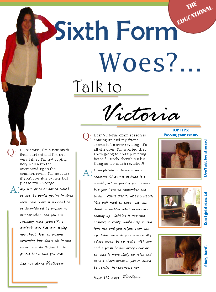
Photography- I am very pleased with the photography I have displayed on my problem page. The three running down the side of the article show a student, which is effective because that is who the magazine is aimed at. I also think they are good because they enhance my 'top tips: passing your exams' (which would be a weekly thing in my magazine) by showing what I have said, such as, for the 'Study hard' tip I have shown a student writing up revision notes. I am especially pleased with the photo manipulation I did on the picture of Victoria which I did using a 'snip tool' which enabled me to take a full picture of Victoria leaning against a door frame and 'Snip' out the bits I didn't want (the only regret I have with this programme is that you do not get a very 'clean' outline which did not give me quite the professional finish I was looking for. So I hope next time I will be able to use better software to get a more professional finish making the article look that little bit better) . This now gives the effect that Victoria is leaning on the masthead which is effective because it makes her seem more involved with the readers problems and showing her in such a relaxed position shows her caring personality which will make more readers wish to write in.
Layout- I think the layout is effective as it clearly shows the colour scheme (orange and green) from the strapline to the border lines around the article. Although the layout is in neat columns perhaps making the page look a bit formal but I think it works as I incorporate my colour scheme throughout with different length lines making it a bit less formal. As you may have noticed my earlier design showed a 'Get involved' box where I was going to write things about school that might interest the students reading the magazine as this was a technique that many other of the problem pages used to break up their articles however when it came to it, it ruined my layout to have such a big solid coloured box featuring on my article and made it look very unprofessional so I scrapped that idea and I did the ' top tip' column which looks much better because it fits in with the layout more and also allowed me to incorporate more photos within my article. If I were to do this again I would have put a background colour in my article as the white makes it look a bit bland however on the other hand it does give a crisp finish to the piece. Also I would not use the programme 'Microsoft word' to create my article as this gave me many limitations to what I could do.
No comments:
Post a Comment